1.6
Architecture - Design - Art
Progetto Palazzina 1 – Roma

(30-01-2019)
Following an idea in which I tend to demonstrate with theories and projects the need to pick up a type of architecture that enhances the real life where people can immediately feel at ease; I’m going to graphically represent my ideas to better understand what I mean by “method of ancient architecture“. The building as the cornerstone of a society that also seeks the sense of its existence in the walls around us; the daily life that becomes a universal element because that place generating a strong sense of belonging, makes us feel at the center of the world and as such part of it .
Plan and build well; a phrase so simple but in reality it has found so many deviations to generate structures that are not exactly exceptional, and often totally alienating. What I will highlight, as already expressed in other articles, is the importance that the details have in architecture, details that contemporary fashions have placed in the background giving ample outlet to the composition in volumes, creating those spatial intertwining that often we leave us interdicted.
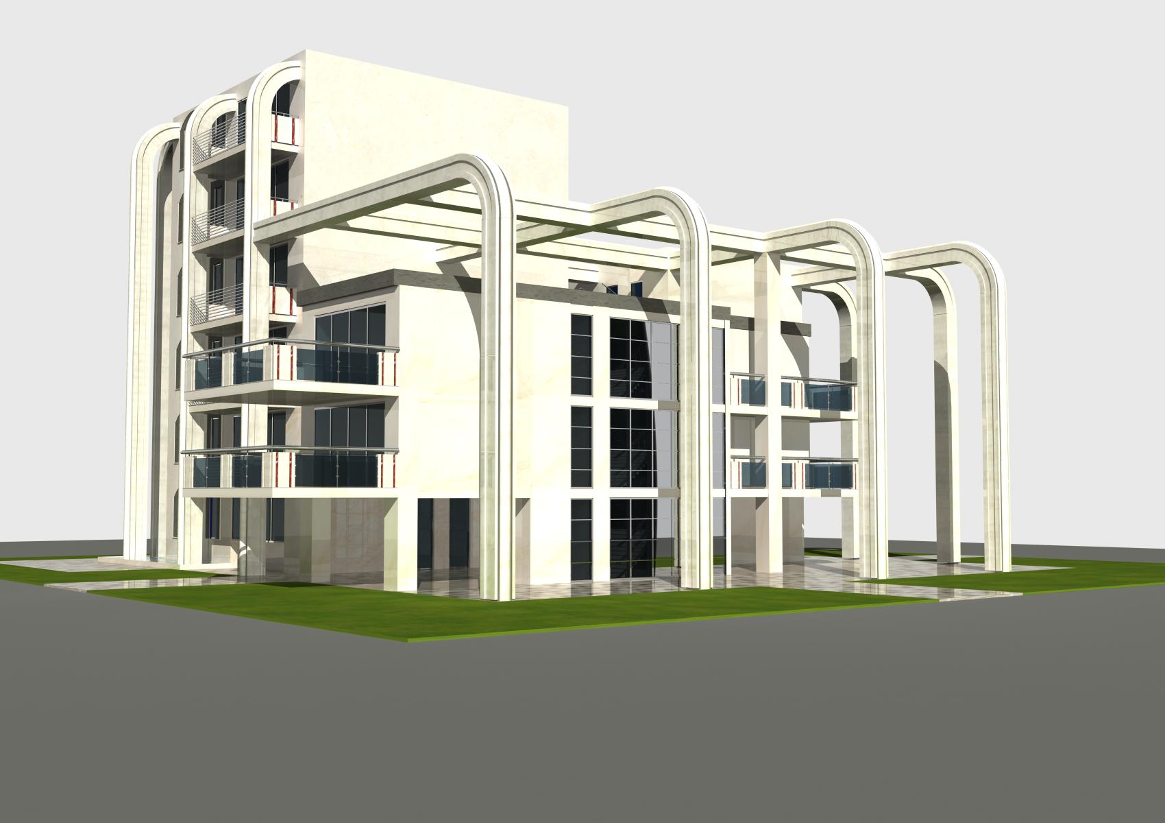
In this project I have tried to combine past and present; we cannot go back in history but we cannot cancel all the good that has been handed down to us. So I wanted to insert in a perfectly square area, respecting the principles of proportions, three buildings with three different heights, like taking up those historical areas of Rome where we find ancient buildings of various heights juxtaposed together.
These three buildings are connected through a load-bearing structure that guides the project in its typological imprint while at the same time forming a single structure, but the three elements are separated. The tallest building, which however does not exceed six floors, stands out from the others, almost forming a square tower that we sometimes see walking through the Italian historic centers.
But the basic thing for me was how we treat these buildings. That is, what kind of materials to use, take care of even the smallest details, give shape to the volumes.
What does it mean to shape the volumes? But doesn’t the volume that occupies that space already have a shape?
Indeed the initial volume, although many contemporary architects understand it as shaping the space around us, alone says little, is what in another article I called “absence of mediation”; this is expected to be representative of the designer’s basic idea without caring if it actually happens in reality, and in fact, as often happens, it does not happen.
Why this? Because there is no mediation given by the details. What I call the “spatiality of the details“, which is the the foundation of all my theory on architecture. The volume, to make it simple, is a bit like raw marble, certainly interesting but incomplete, to make it stand out in all its beauty the sculptor, through his chisel, will take care of providing him with all those details in order to make it a work art.
And here it that the volumes of the building, after being defined, will be treated providing each one its own particularity, so the pillars have been worked in order to obtain bevels, rounded reliefs in the front with the insertion of strips in peperino (typical Roman stone) to highlight its shape. In addition, these laterally have very slight flares where we could add a different material or some modern decorations.
Roman travertine is the material that covers all buildings, this element is fundamental, without a material of a certain quality we would not have the same result; perhaps we would have it on paper but in reality it would degrade like so many others, making the design intention vain. A material such as travertine, on the other hand, in addition to being part of Roman culture, over time would acquire a greater charm, creating that sense of belonging that binds people to the place.
The parapets of the terraces, partly in glass, partly in travertine, they also undergo that process of “particularisation“, creating red marble inserts. Why, they will tell me, did you insert these small elements in red marble? What are they for? Well, these elements are actually fundamental because they define the object, in this case the terrace.
The terrace is part of a whole but at the same time detaches it and does it precisely through those distinctive elements, in this case the inserts in red marble.
This step is very important because it makes us understand the design method, as the detail is not put there by chance but is used to give each functional element its own aesthetic specificity. As well as the windows of the small tower which are surrounded by peperino ( typical Roman stone) slabs which underline the importance of the material.
Green, water, technologies, all the elements are part of a whole.
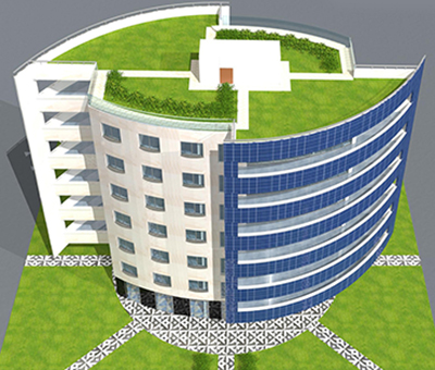
Photovoltaics often find it as an element simply juxtaposed on the roof because we do not know how to give it a location, in this case it plays with the other parts of the building inserting itself into the whole structure.
Other details are the three bands of the terraces of the medium-height building, where the shops on the ground floor are inserted, made of copper, steel and travertine with basins in which through small steel uprights it is possible to grow vines. The fountain on the corner to the tallest building, the green roofs of the lowest buildings. All these details constitute the real meeting point between real and mental space. What mental space is, we will elaborate on it in another article.
Mouse over image to stop it
© Arch. Alessandro Plini (www.archihouse.it)
Contacts for projects: info@unopuntosei.net or info@archihouse.it
Mob. +39 3496039795


